I worked with FTSY to design a 3D measurement experience for their app, which helps users find shoes with the perfect fit.
Since their branding was at a very early stage, FTSY asked us to focus on creating a solid flow for their core functionality: the 3D capture process. Later, FTSY would re-skin our designs and build the rest of the app around it.
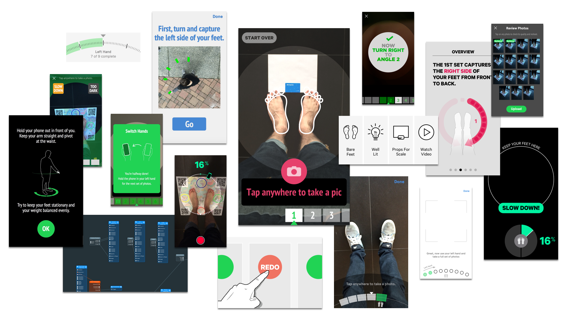
Through a process of interactive prototyping and user testing, I created an intuitive flow that guides users through capturing and vetting the high quality photos FTSY uses to generate 3D data. I also created concepts for other parts of the app beyond just foot measurement.
It’s a worry we’ve all had when buying shoes online. Sizing is inconsistent across different brands and even within them. What’s more, feet come in all different shapes even if the length is the same.
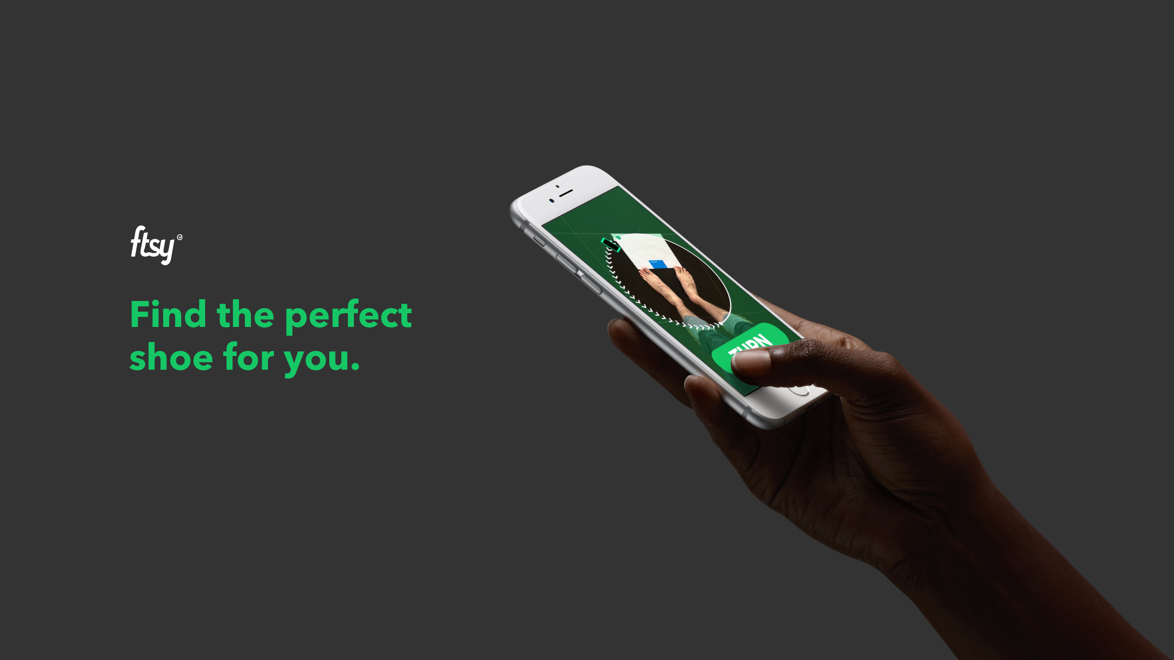
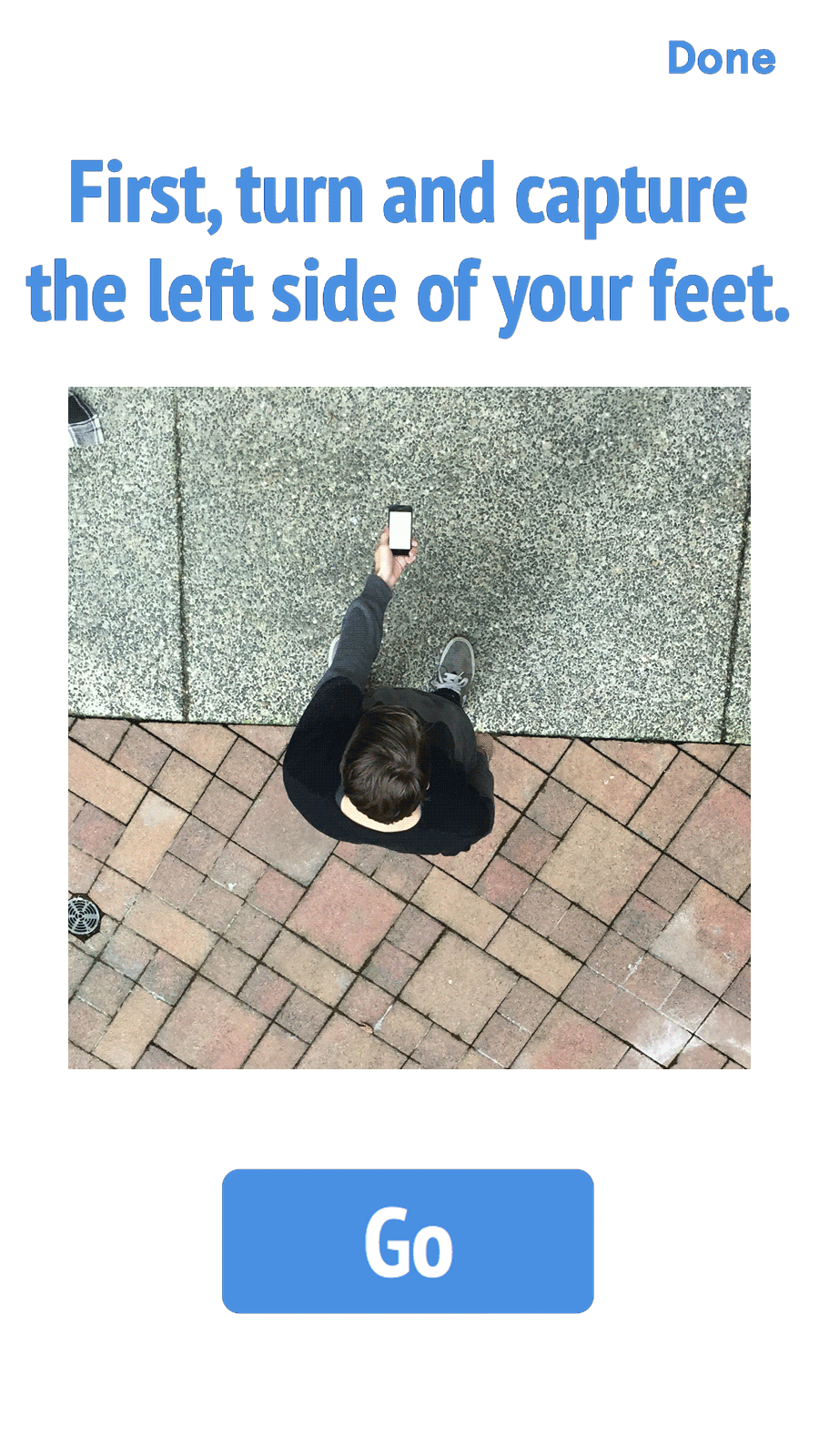
Finding the perfect shoe for you means understanding the shape of your foot and the kind of fit you prefer. To measure accurately, FTSY takes a series of photos and turns them into a 3D model of your foot.
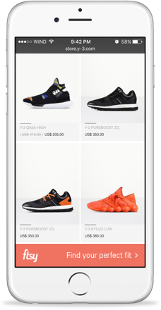
Shopping for shoes online is the best way to see a wide selection - but there’s no way to try anything on or see how it feels.
FTSY helps users take a panorama capturing their feet from all angles and creates a 3D model of the foot.
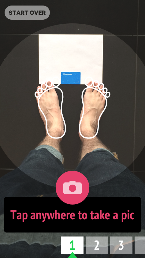
Our work was focused on this step.
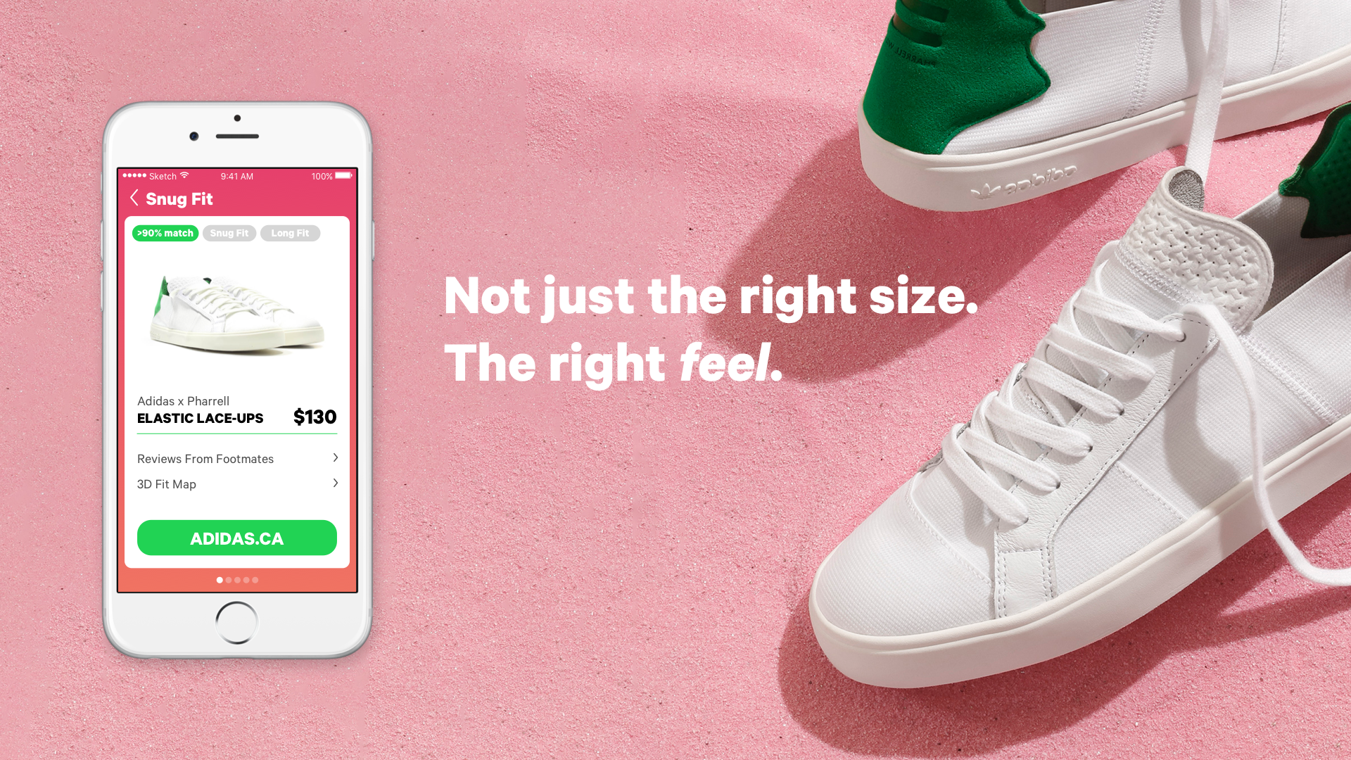
FTSY helps users choose shoes that fit their foot shape with the right snugness in the right spots.
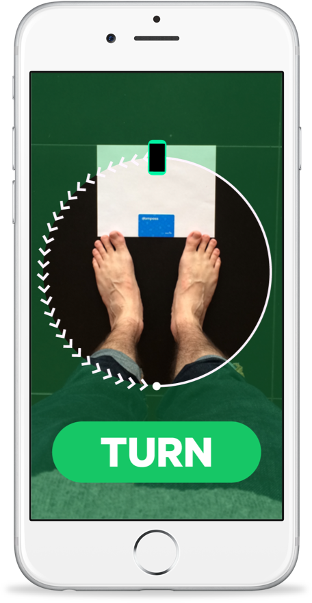
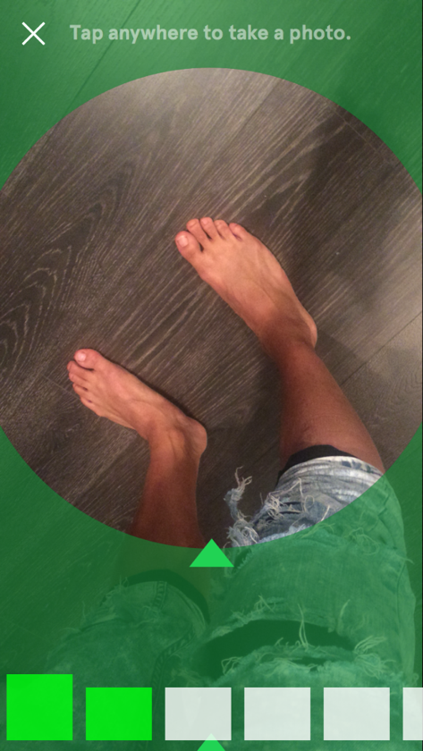
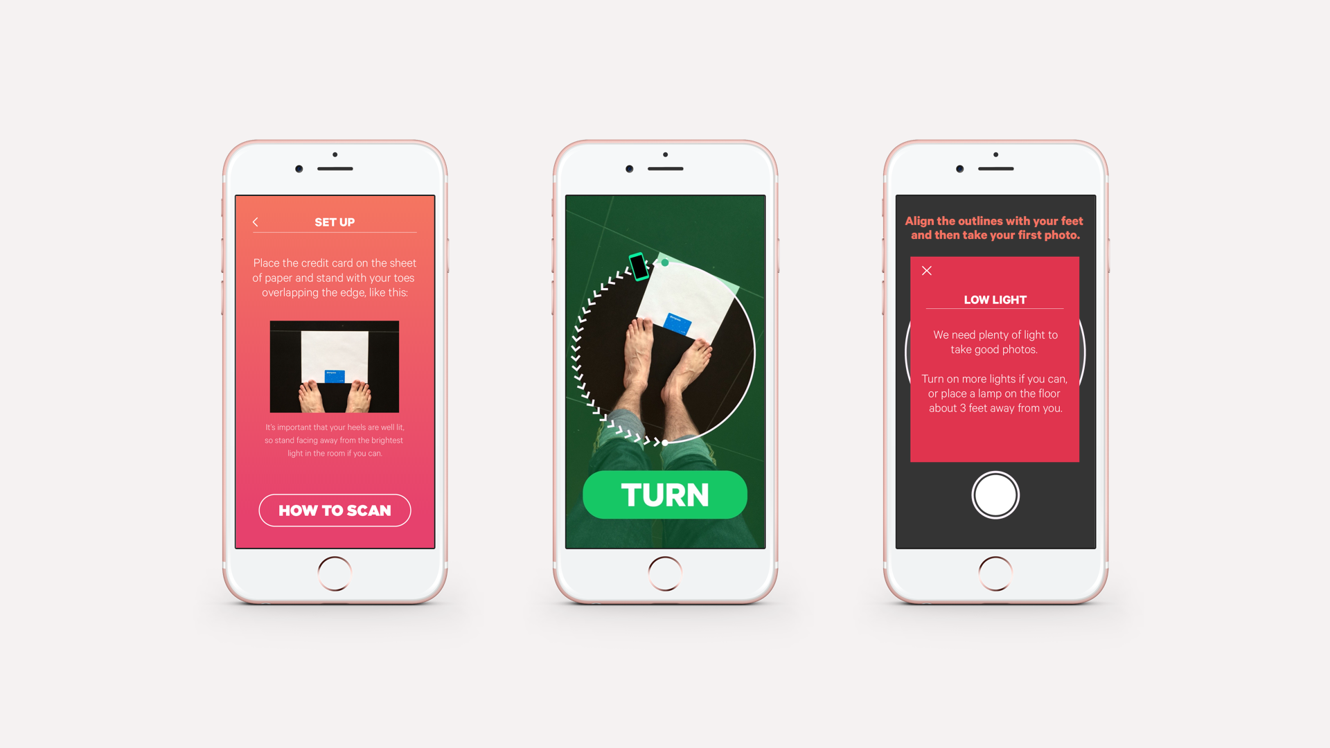
FTSY’s tech team needed around 10 photos to create accurate 3D models. Since taking photos from the required angles was ergonomically strange to users, the main challenge was guiding users though the process while minimizing errors, bad photos, and misunderstandings.
We explored different ways to visually represent a sequence of photos taken from different angles.
At first, we built prototypes based on the concept shown here, with the idea that it would be valuable for users to understand how far through the process they were. We would later simplify to a more step-by-step approach with lower cognitive load.

The process also needed to have defined breaks in the action where we would give guidance on what to do next. How often to do this, and how best to explain?
Using simple animations or videos was really engaging and universal - a way of showing without telling.
We also began using a condensed font that improved readability when holding the phone at an angle away from your face.
We prototyped several quick mockups using Form, which was the perfect tool because we could use the phone’s camera and accelerometer to show UI elements moving onscreen as the user turned to take photos.
This was a fantastic way of testing if our UI concepts made sense in practice and learning more about what affordances were needed.
I’d never used Form or any other nodal programming interface before, but I really enjoyed learning it and found it more intuitive than writing code.
After establishing our initial direction and validating with rough prototypes, we built out mockups of the experience in order to create a more polished prototype we could test.
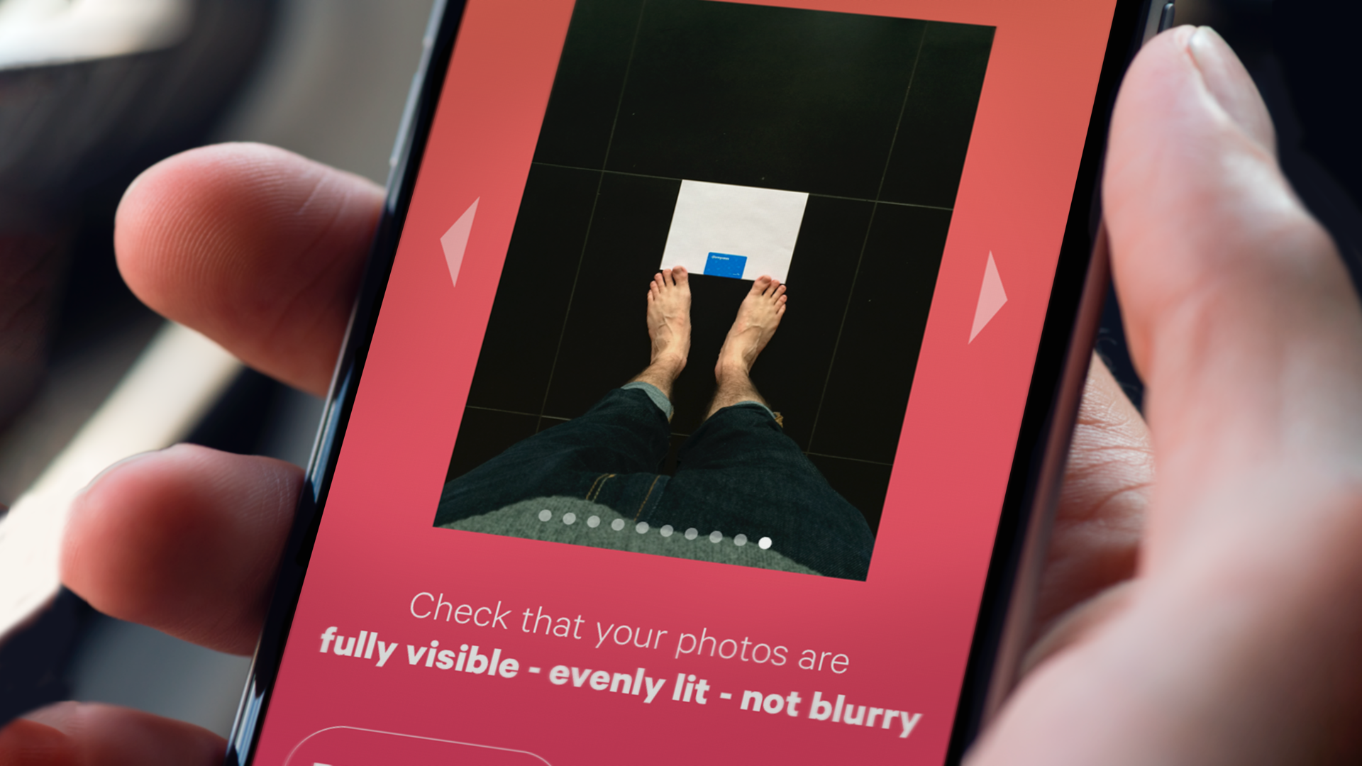
We tested our working prototypes with 8 women and men from age 20-40. It became pretty clear from both the users' comments and the quality of their photos where we needed to improve:
People had trouble tapping the screen when holding their phone at arms' length
People weren't getting our UI for indicating which angles photos needed to be taken from
People were taking images with motion blur or feet partially out of frame
People found it challenging to hold their phones at the correct distance from their body
Eva
"I thought my feet had to be covered by the white outlines... but that was not the case."
Annie
"I was afraid I would drop the phone!"
Zoe
"Maybe reduce the amount of taps to take pictures?"
Andrew
"I didn't realize the numbered boxes were akin to a compass."
Ghazale
"Maybe have the feature of taking continuous photos?"
We were asking our users to do too many new things at once, leading to confusion and uncertainty. The unusual ergonomics of the situation added an extra level of unfamiliarity and stress.
Here are the specific changes we made:
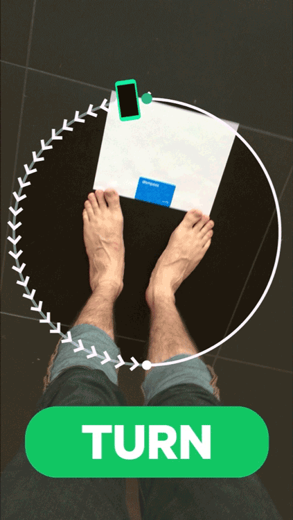
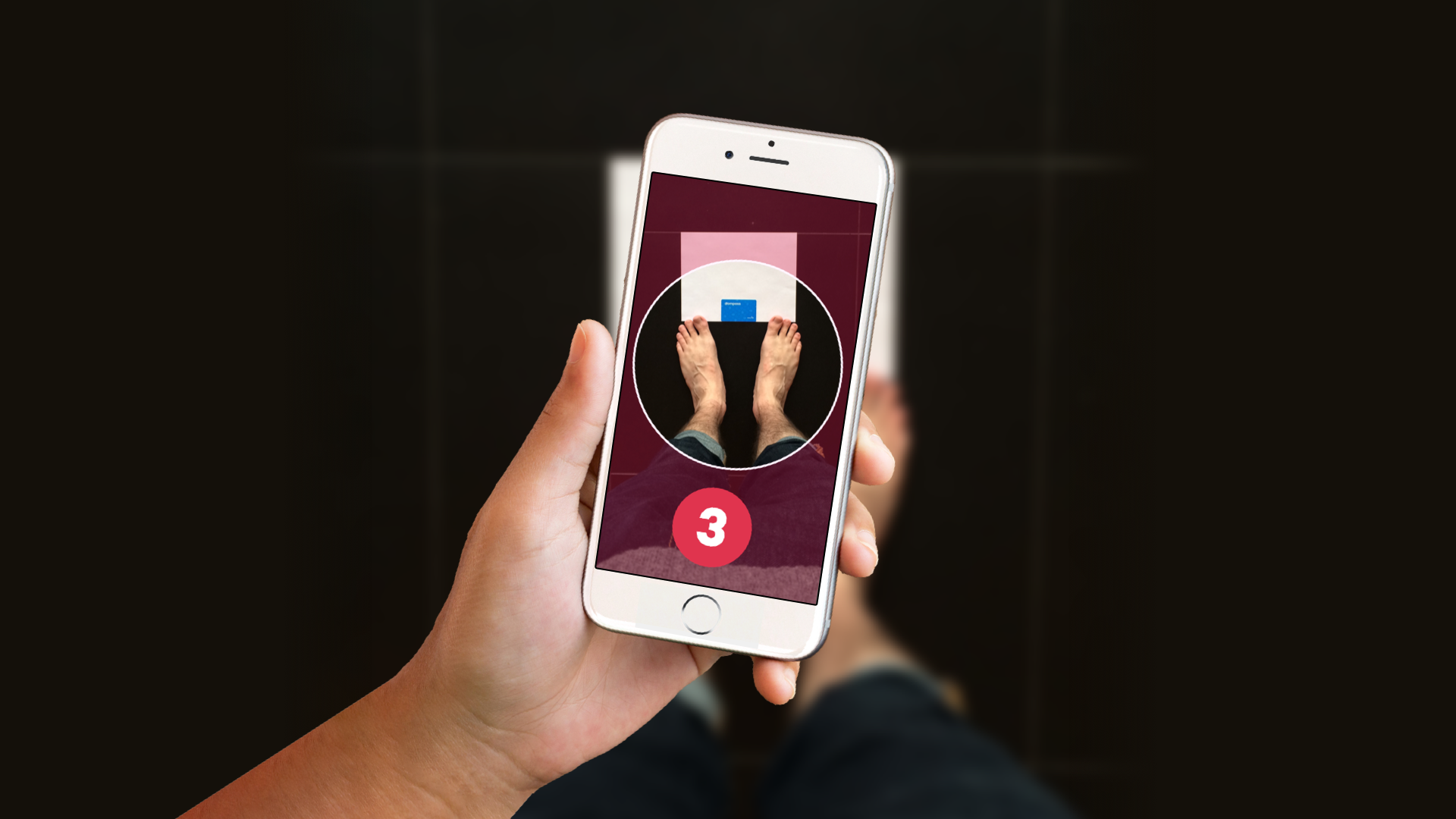
We eliminated the need to tap the screen by taking pictures automatically when the phone was at the right angle
We stopped indicating specific angles to take photos from. Instead, we had the user slowly turn, and told them to stop when we knew they were at roughly the correct angle.
Eliminating the need to tap also improved image quality, since it allowed people to hold the phone still with a steadier grip
We made it easier for users to hold the phone away from their body by simplifying the UI and enlarging the text for readability
Overall, simplifying the process to just directional stop and go signals reduced the cognitive and ergonomic load and made it a lot easier for users to get good quality photos.
Testing our revised designs, we saw a marked improvement in users' performance during the process. The difference in the quality of the 3D files generated from the images was significant, according to FTSY's engineering team.
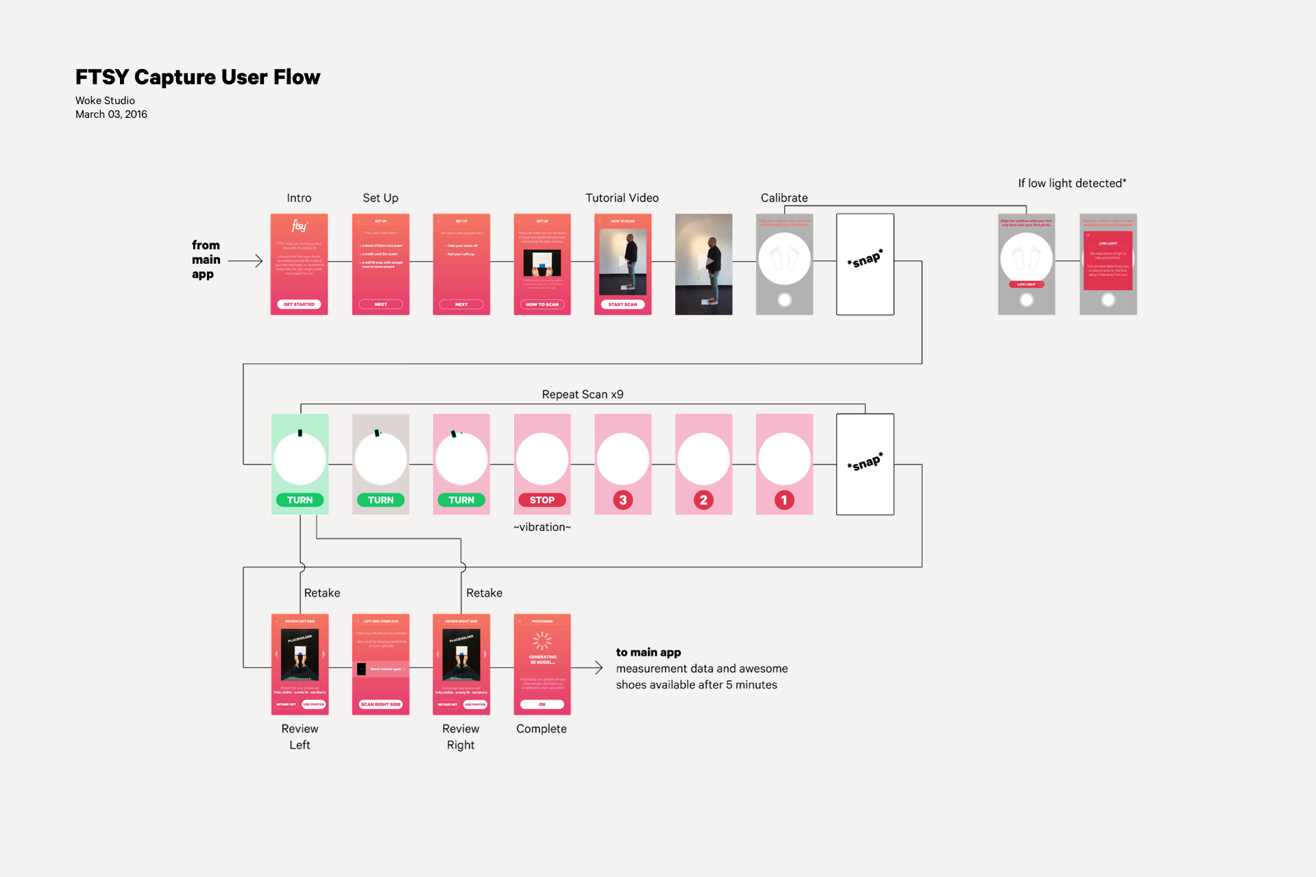
Below is one of the flow diagrams we shared with the FTSY team alongside the working prototypes.
The measurement section of the app is quite linear, consisting of 3 parts - Prepare, Scan, and Review & Reshoot.
Although the measurement process is crucual to FTSY delivering value, the big emotional payoff comes after measurement - seeing your feet modeled in 3D and browsing shoes.
Get involved in setting requirements
FTSY came to us when their technical requirements were mostly set, but the brand requirements were still evolving. As a result, we weren't able to suggest alternative ways of capturing photos of the feet. If we'd had the chance to be involved at an earlier stage we could have rethought the capture experience in a deeper way.
Only test what you need to test
We created a very high-fidelity prototype that looked, moved, and worked like the real thing. This made it easy to show to users, but we invested a lot of time in hacking together a way to capture high-resolution photos using the limited Form software. In the end, it wasn't really necessary to capture real photos during the user test, and we could have spent that time iterating more on the UI.
Design for space and movement
For me, this project was a chance to level up my prototyping skills, diving into Form and nodal programming for the first time. Getting users to intuitively understand where to hold their phone in 3D space was a really unconventional communication challenge, and it was a great exercise in reframing a problem. It was also an opportunity to use the physical ergonomics and spatial skills I learned in school doing industrial design work.

I led the design of PAI Health's Apple Watch app, which lets users see their PAI score throughout the day and track their heart rate and intensity levels as they work out.
More ➝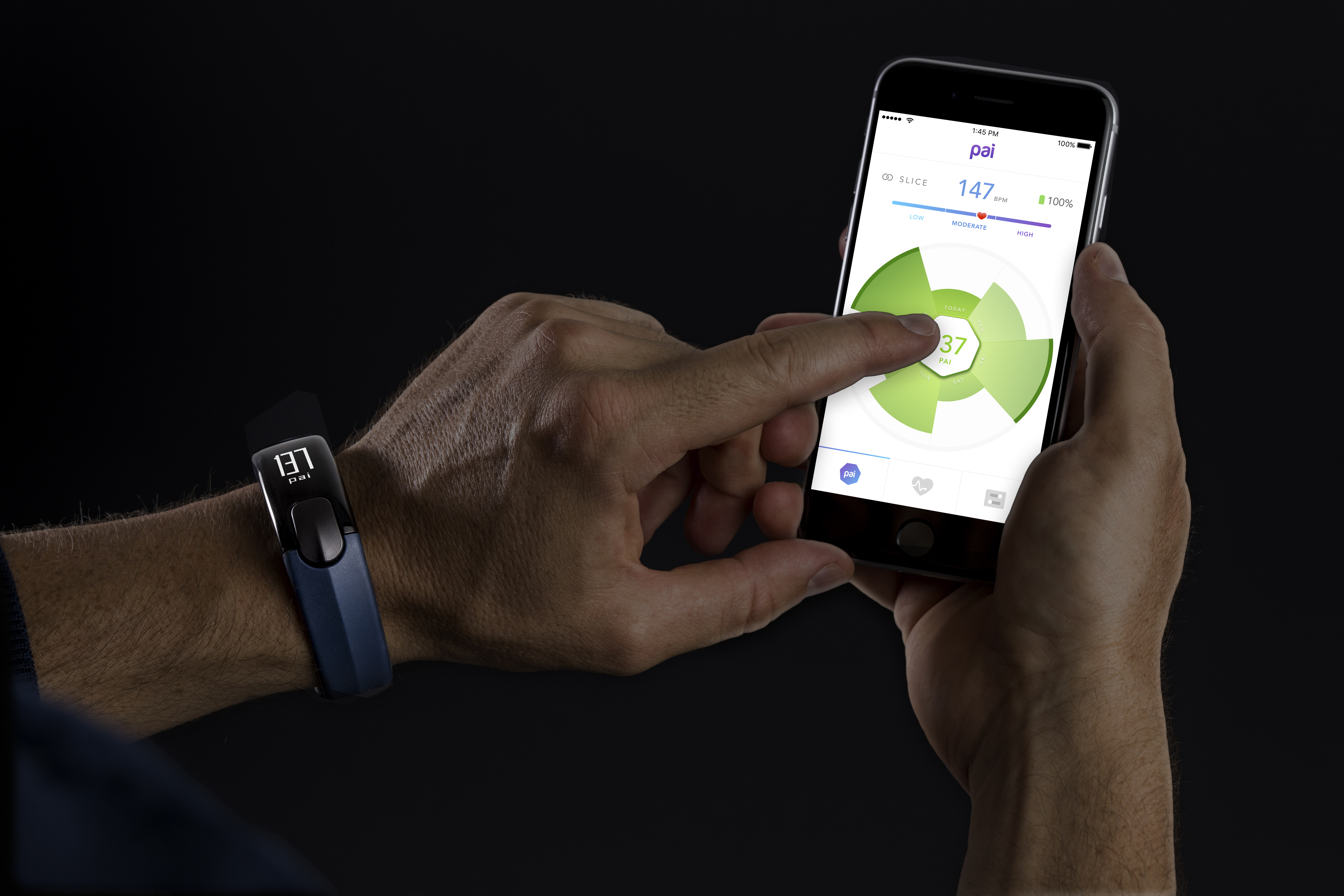
I worked on UX and UI for PAI Health's fitness tracking app, working with the development and product team for over a year to bring PAI to market.
More ➝