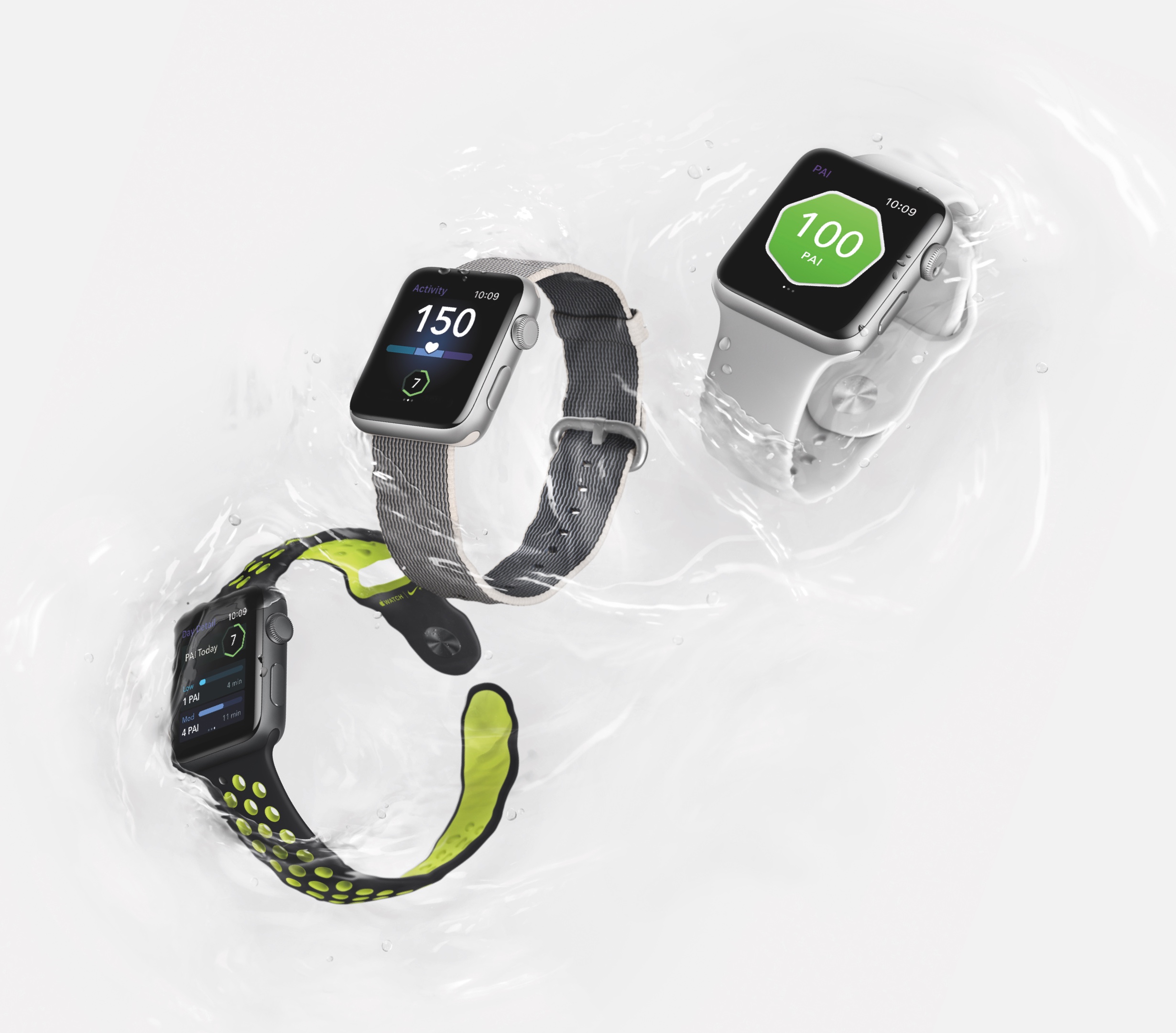
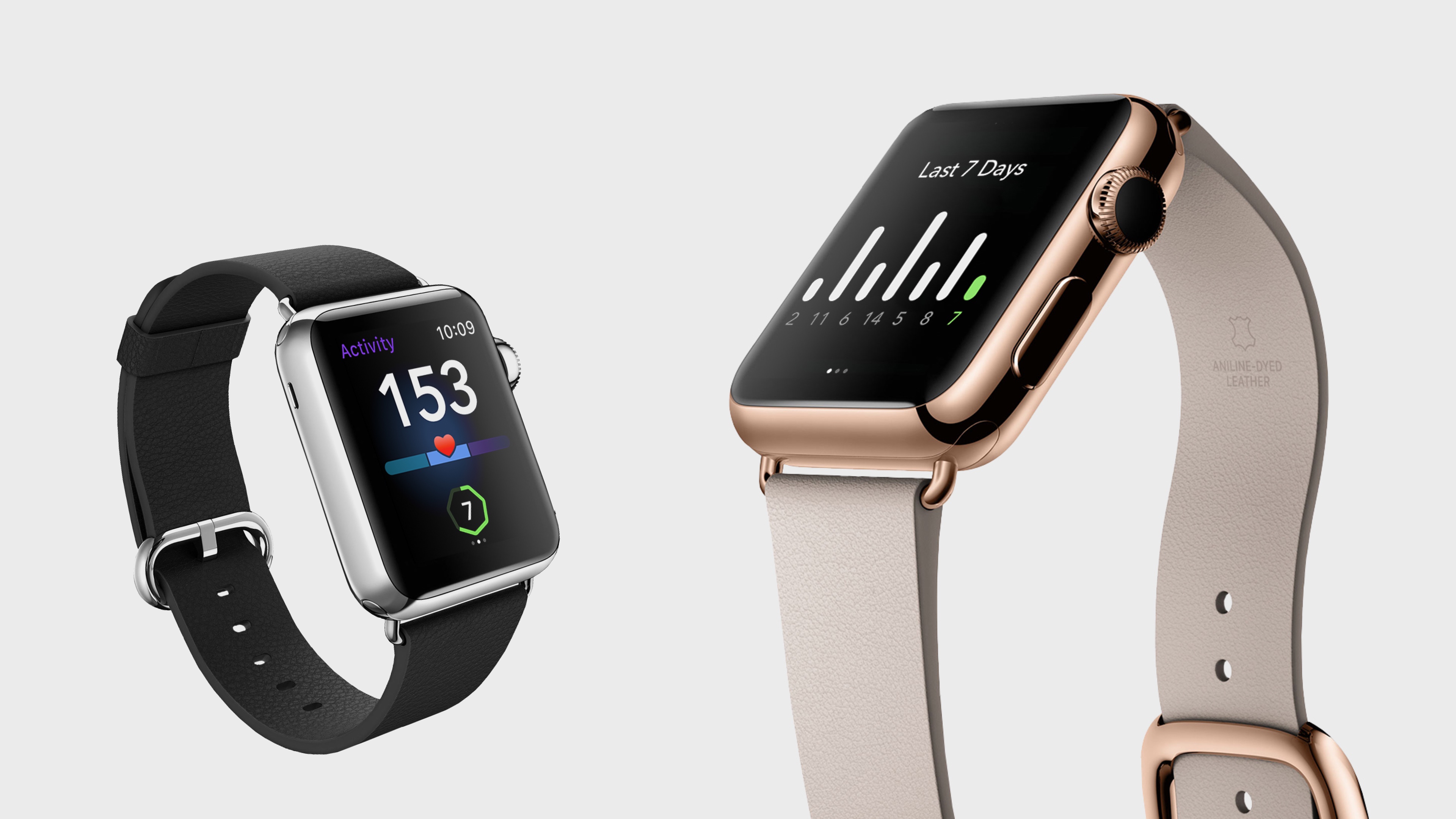
PAI Apple Watch makes it easy for fitness-focused people to track their heart rate and intensity levels as they work out, and see their PAI score throughout the day.
I led the design process, working closely with PAI Health's product management and development team. Because of pressure to launch at CES 2017, we only had around 4 weeks to complete the design phase.
We knew it would be crucial to stay focused on our 2 key features: showing the current PAI score, and tracking a workout.
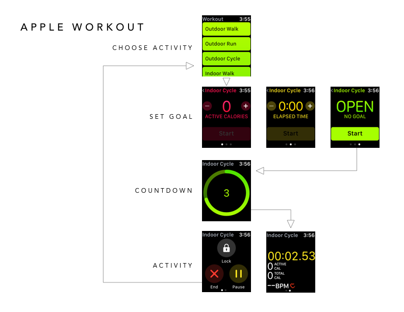
Since we were new to Apple Watch, we spent some time researching best practices first. Here are some of the principles we applied during our design process:
Features need to be useful in the moment while wearing the watch
Use familiar UI elements and branded features to communicate the app’s purpose
No deep menus or convoluted flows
Keep everything as simple as possible
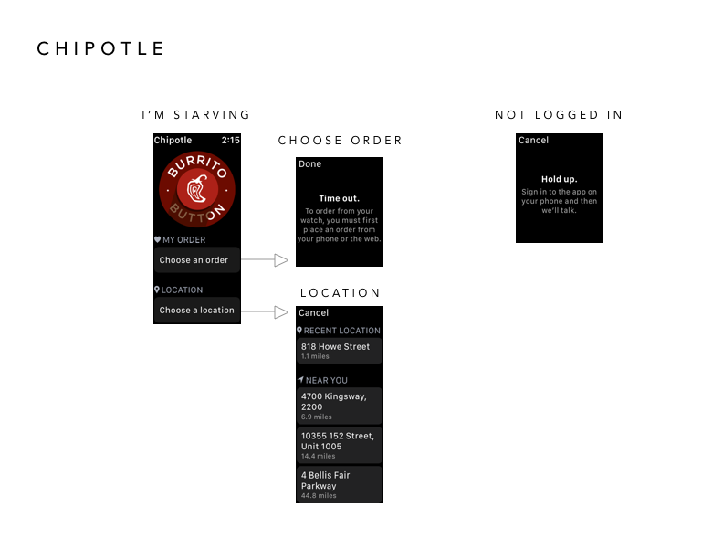
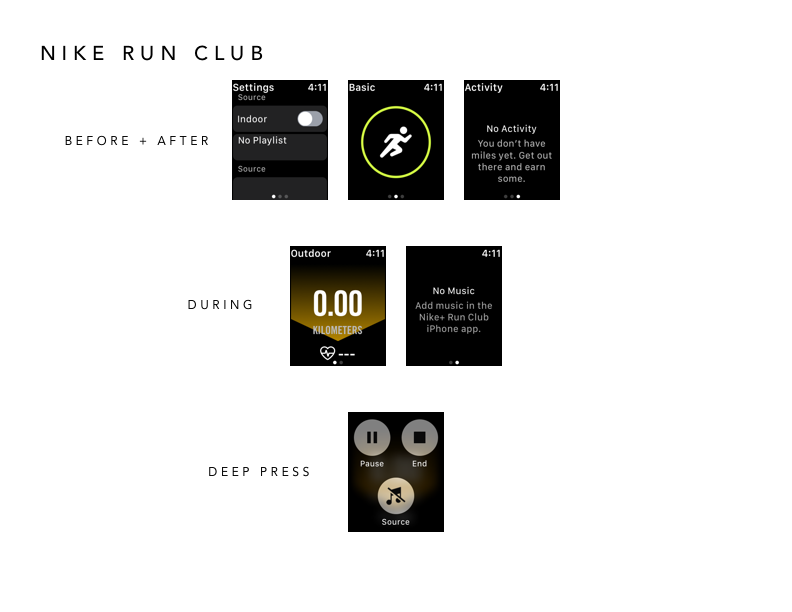
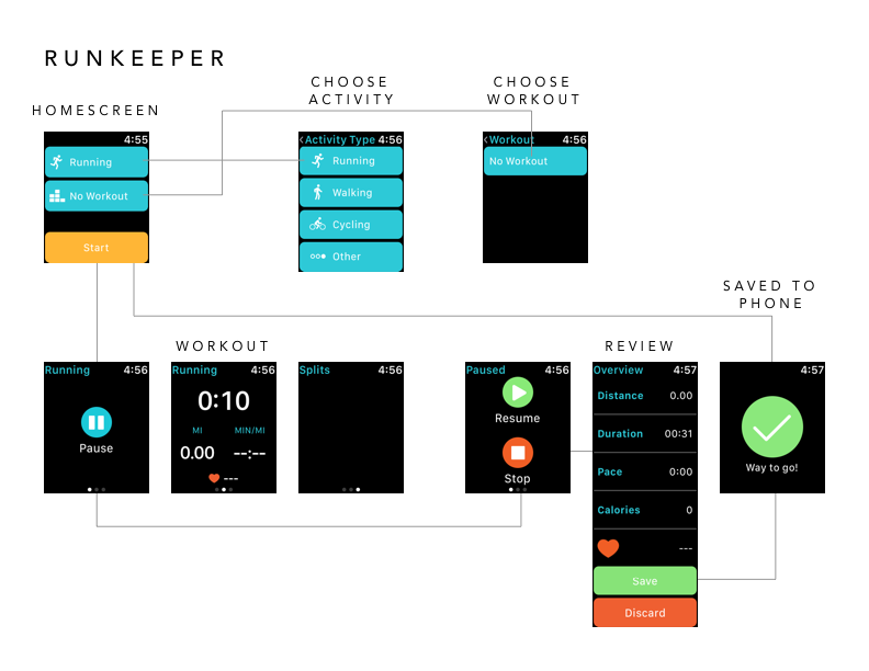
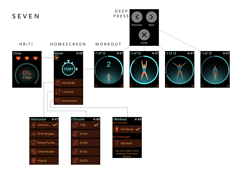
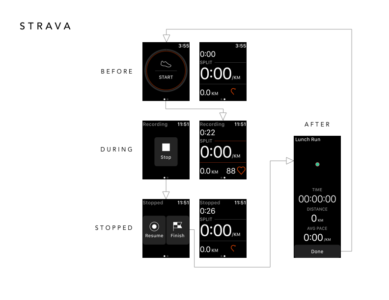
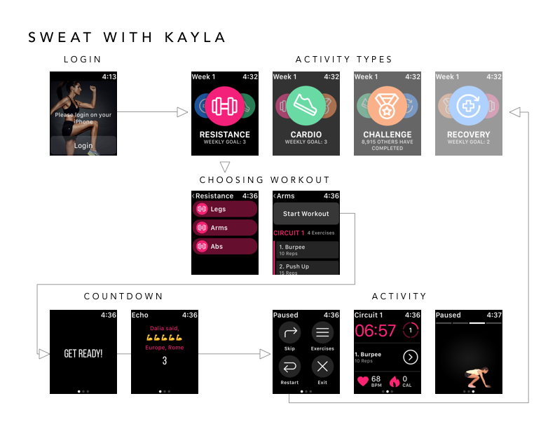
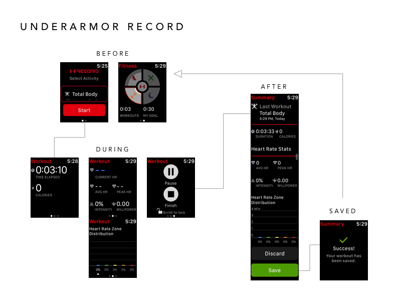
I also looked closely at the features, architecture, and visual design of other Watch apps. PAI hadn't done much competitive analysis of their own, so my research was really useful to them in confirming that they had the right priorities in mind.
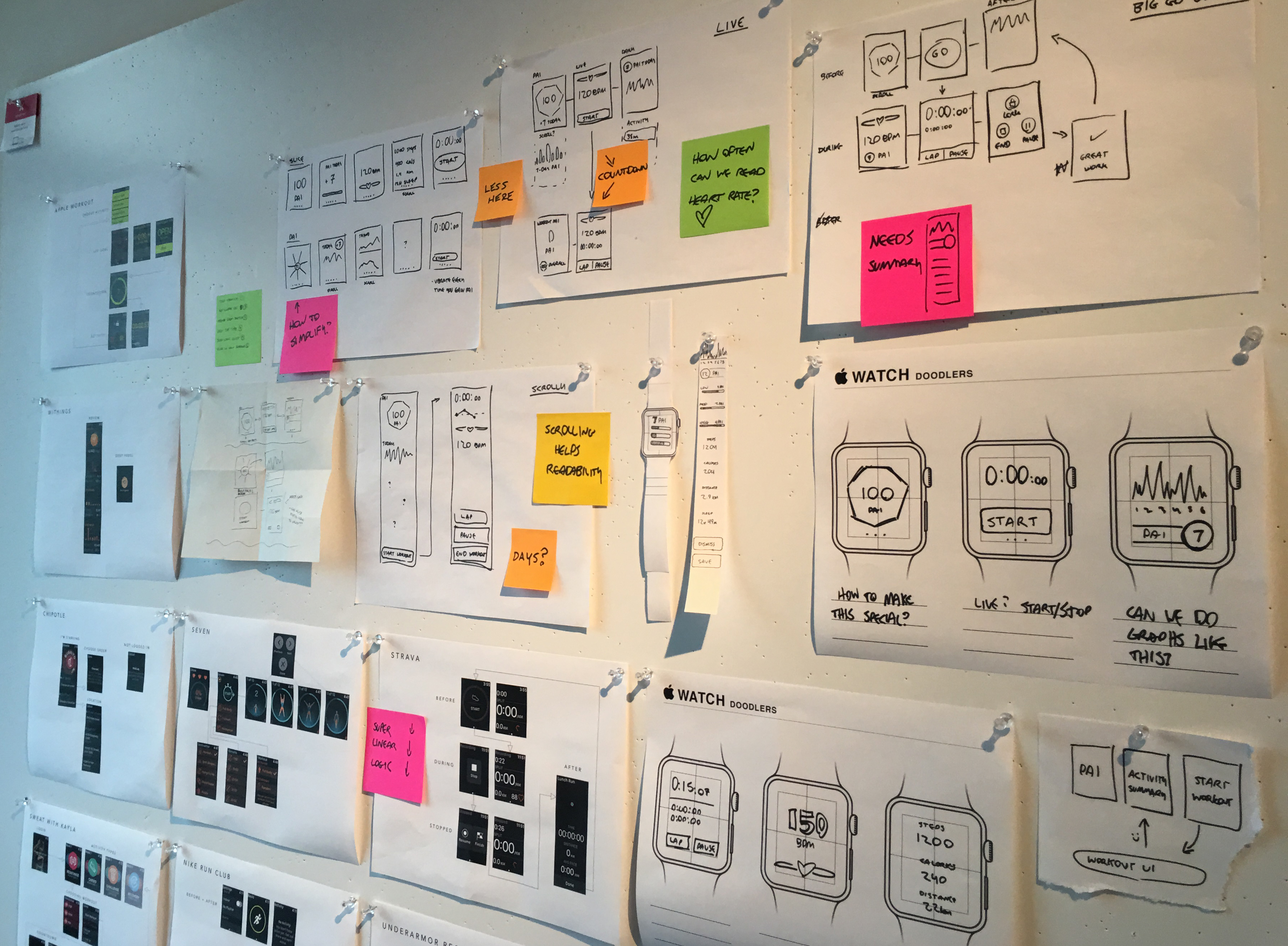
Since screen space was constrained and our feature set was well defined, we mostly experimented with which features to group together.
Because the scope of the app was so small, I could move quickly and sketch options by hand.
It became clear that we'd need to display 3 main groups of information at different times:
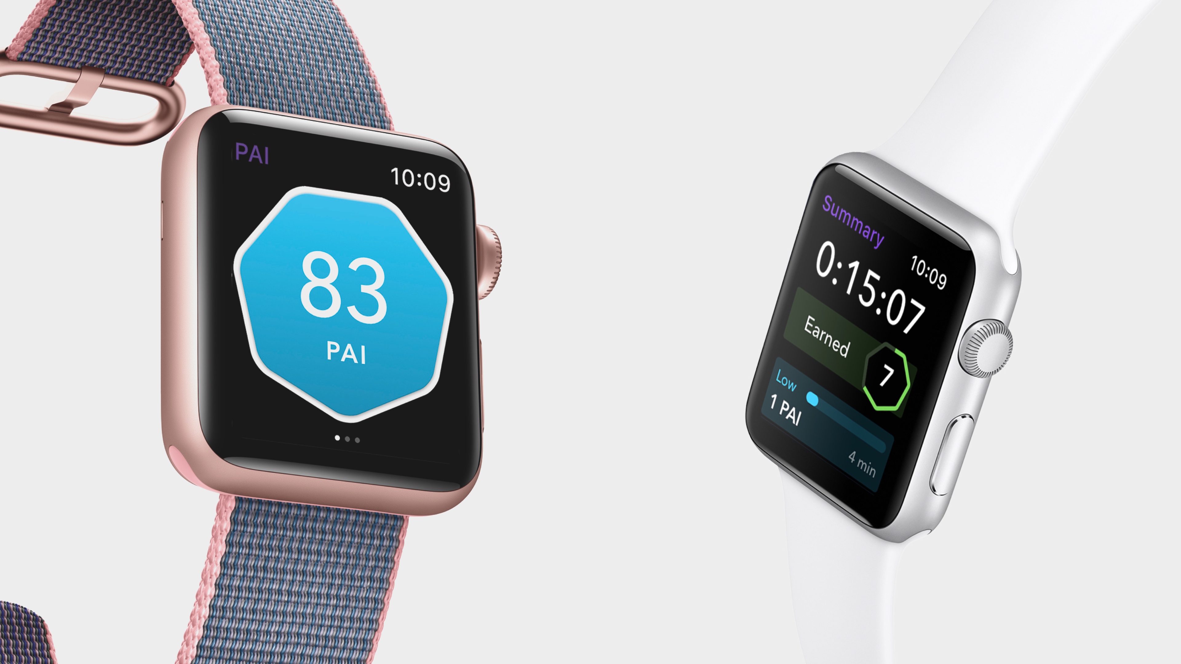
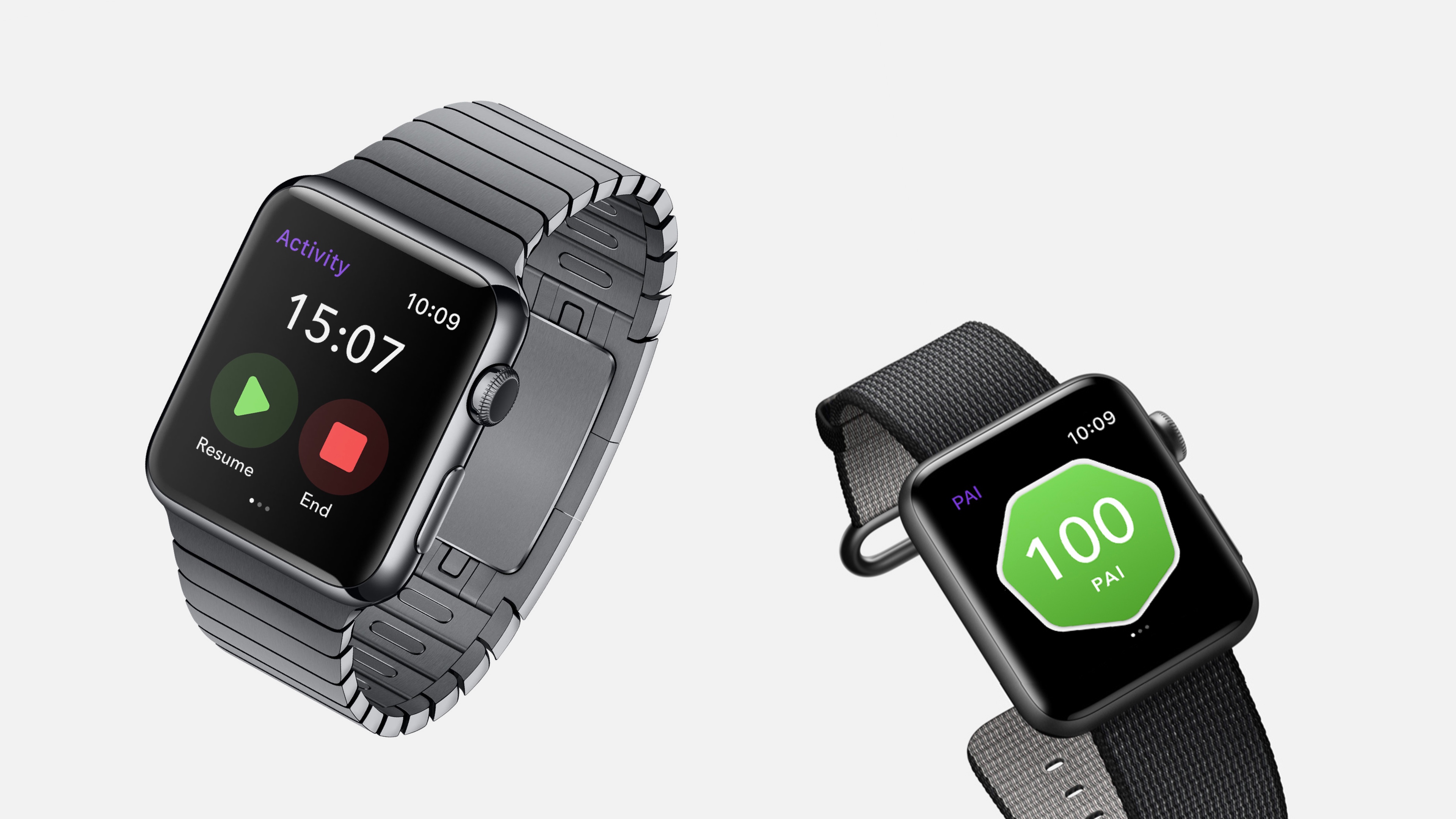
Home, showing PAI score from the day so far
Workout, showing live data at a glance during a workout
Summary, showing a review of the workout after it ends
After some iteration, I developed 5 distinct concepts to build and test at higher resolution.
Because of the low number of screens, it was reasonable for me to prototype all 5 concepts at on an actual Watch using Marvel. This was our first opportunity to learn how the designs would work on an actual Watch, and so we were eager to learn as much as we could by comparing the 5 approaches.
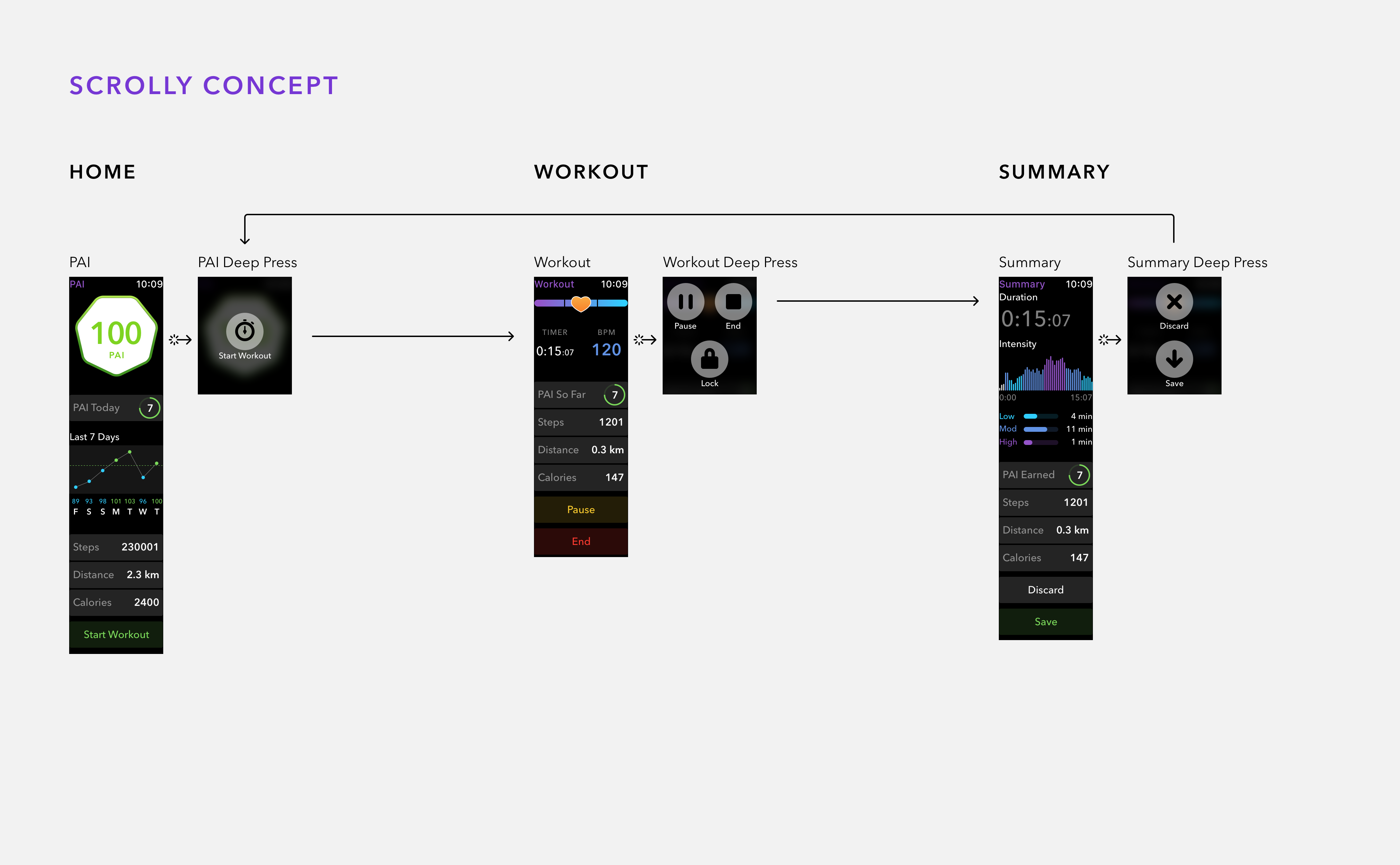
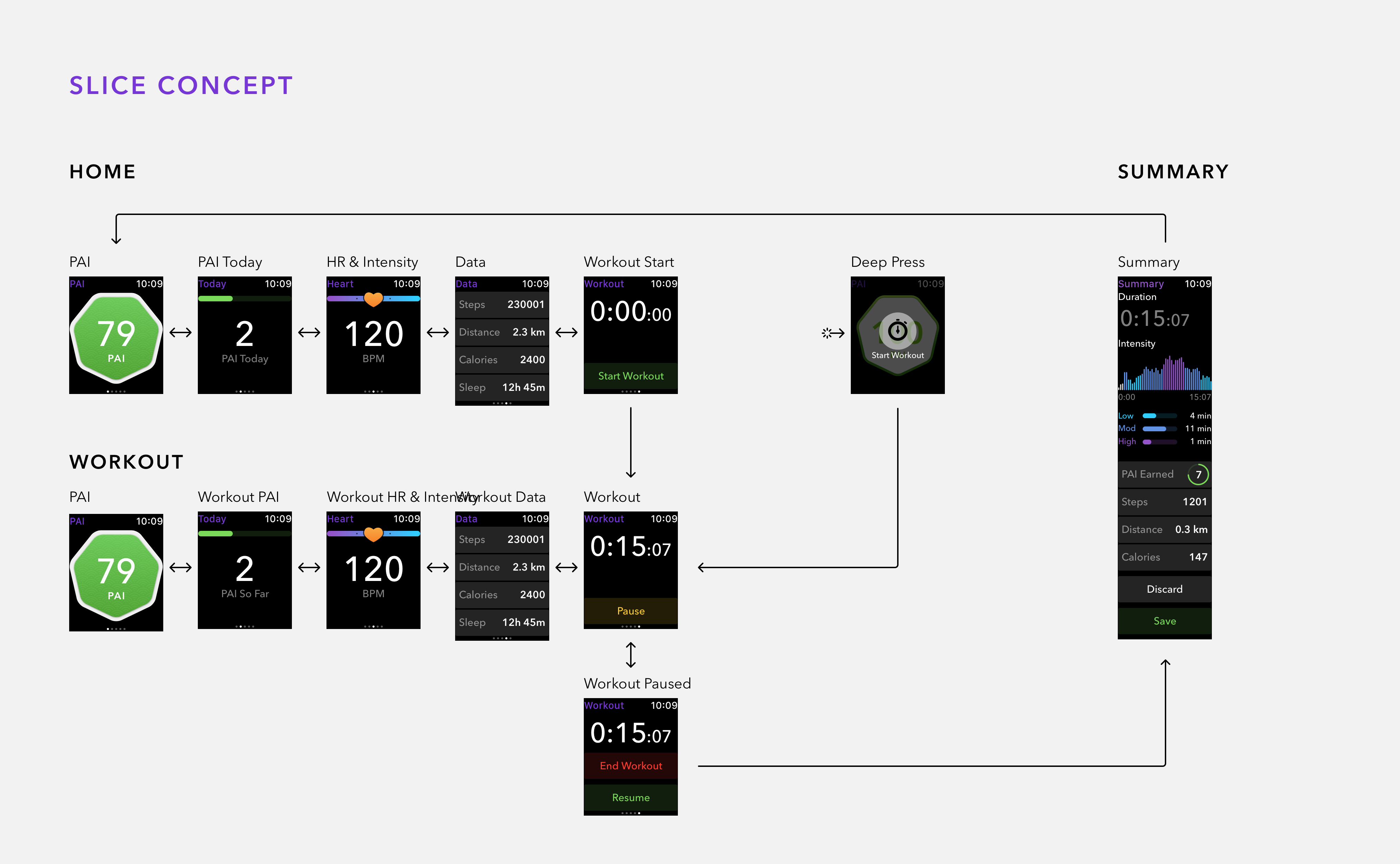
"Scrolly" showed only one long scrolling screen at any given time, using a deep press to let the user switch modes.
We liked the simplicity of it, but not all users knew to try a deep press or even to scroll to see more content. We were also worried that such a rigid architecture would make it difficult to add more features in the future.
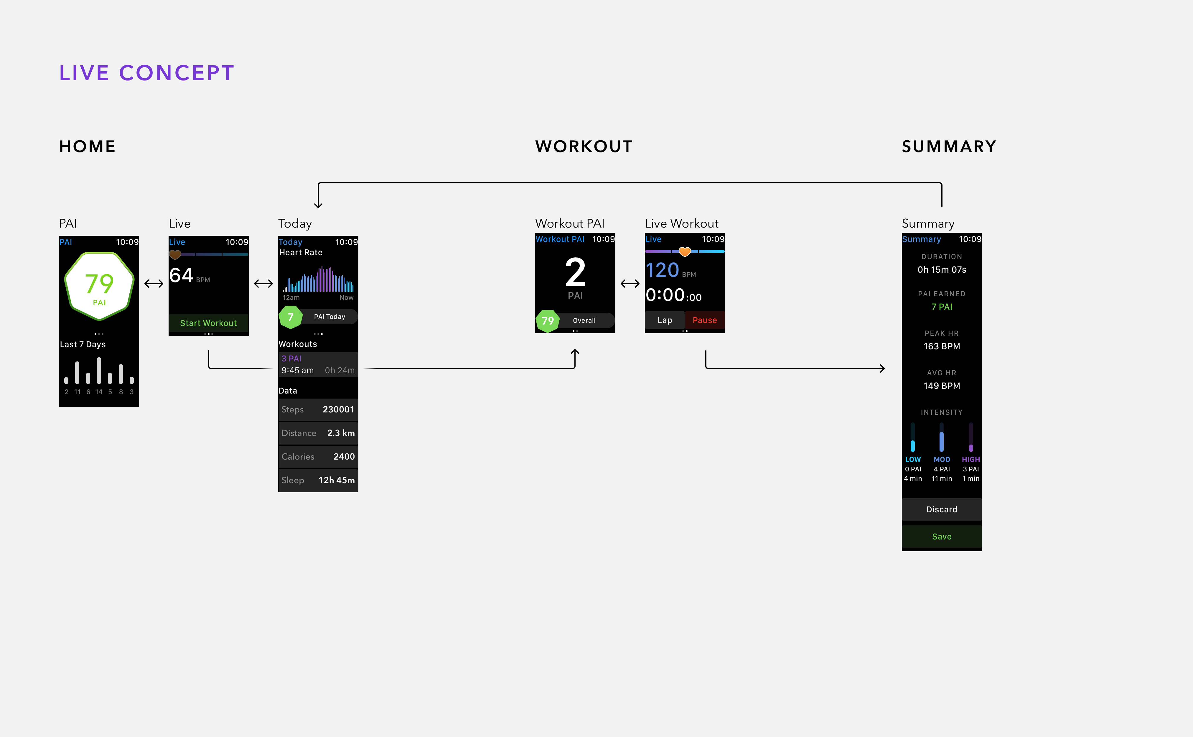
"Live" was based around one screen that always showed your heart rate and intensity, whether you were recording an activity or not.
It turned out this wasn't technically feasible because Apple's heart rate sensor API only allows tracking when the user explicitly starts an activity.
"Slice" was based on the interface of PAI's Slice wearable, showing one piece of information at a time on a carousel of screens.
There was little differentiation between being in or out of an activity, so we ran into the same Apple heart rate API issue as the "Live" concept. We also felt that the UI wasn't glanceable enough, forcing users to stop and swipe to see different information during a workout.
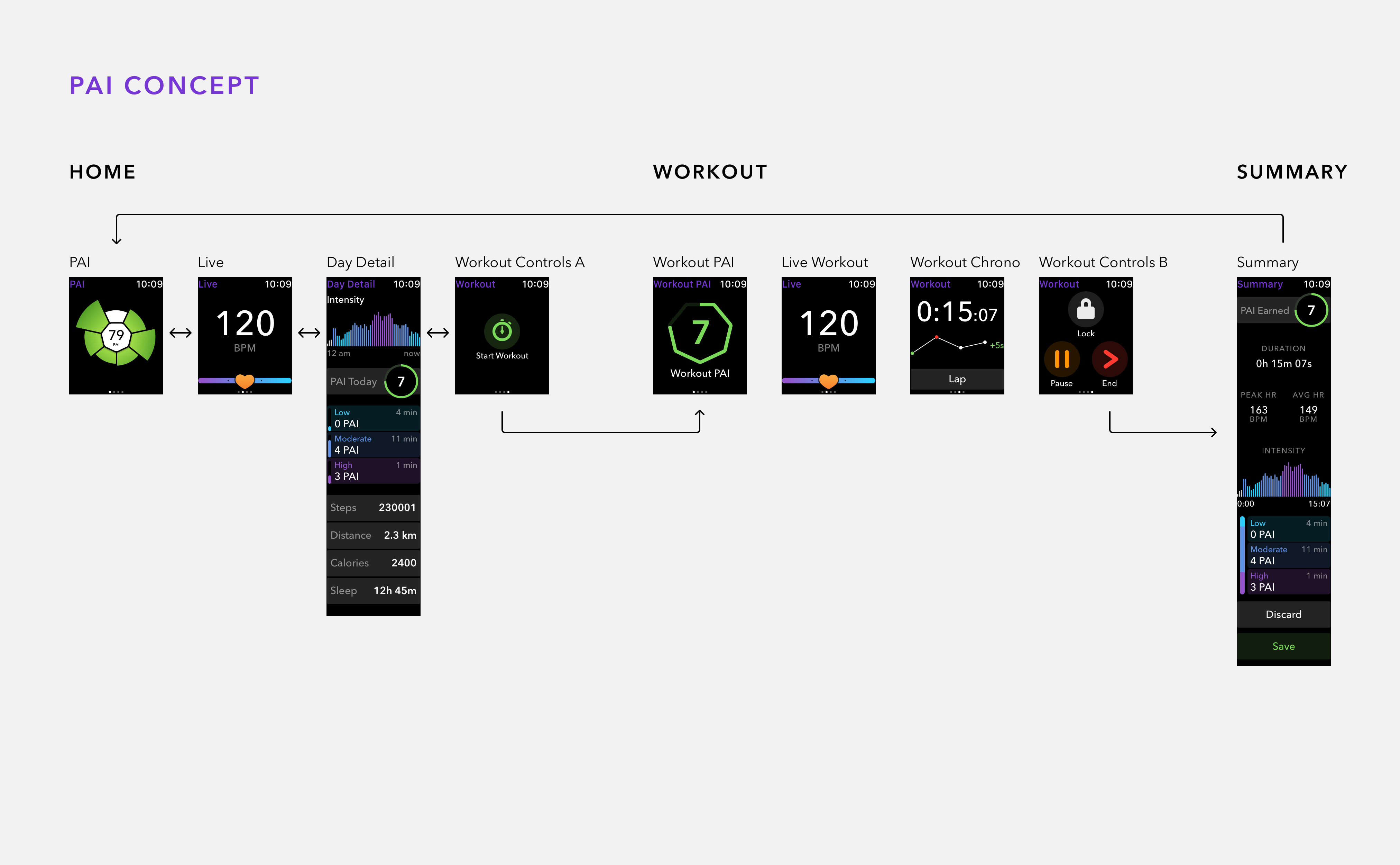
"PAI" used recognizable layouts and UI elements from the PAI app, and so it was the easiest to understand for users.
This was the original direction we selected, but it became much more similar to the "GO" concept as it developed.
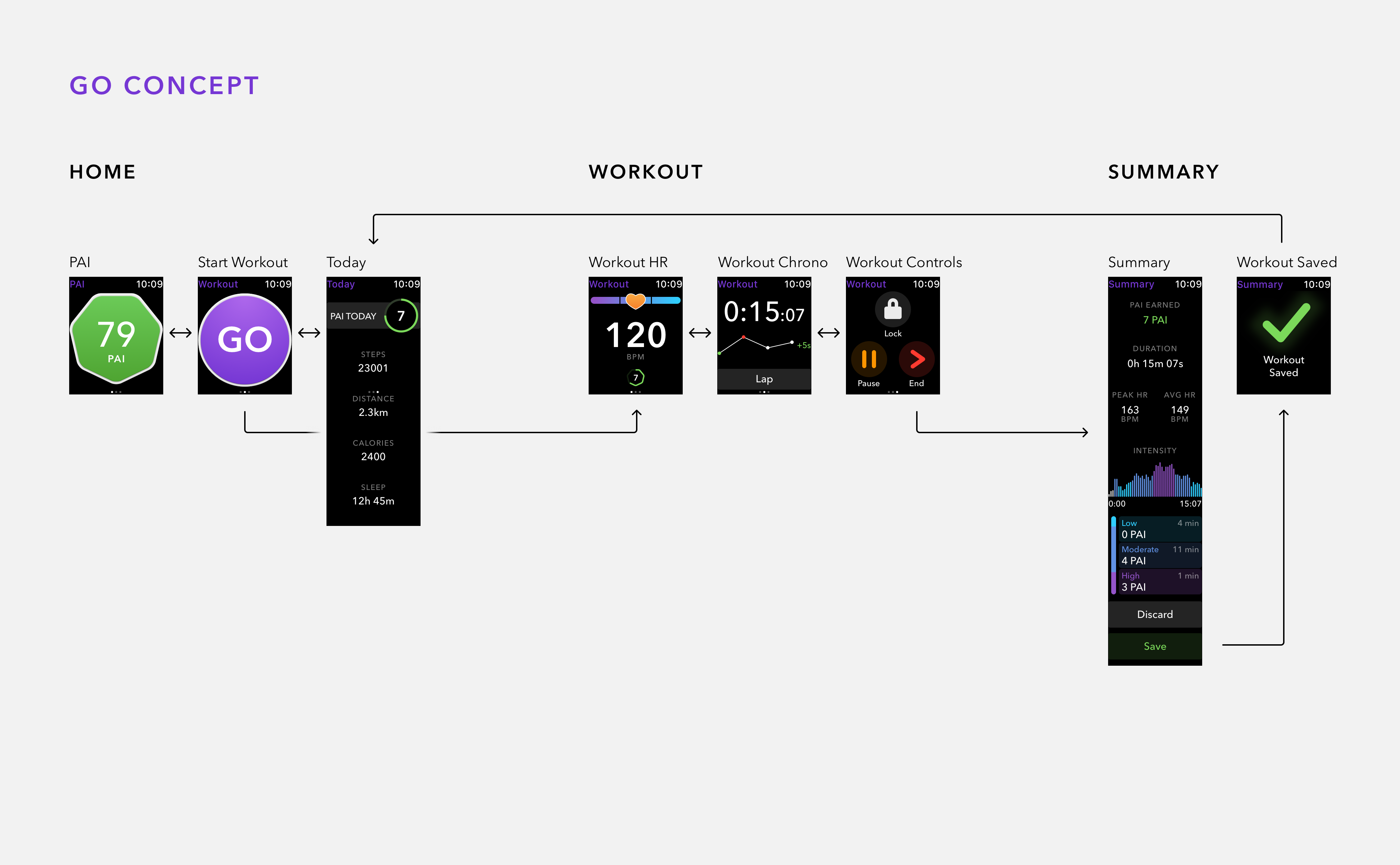
"Go" is the closest concept to what we eventually built. The two standout UI elements of the PAI badge and GO button emphasize the two main jobs of the Watch app.
In the end, we removed the "lap" visualization and vertical bar chart, adjusted the visual style of lists to be more compact, and added extra cadence information during an activity.
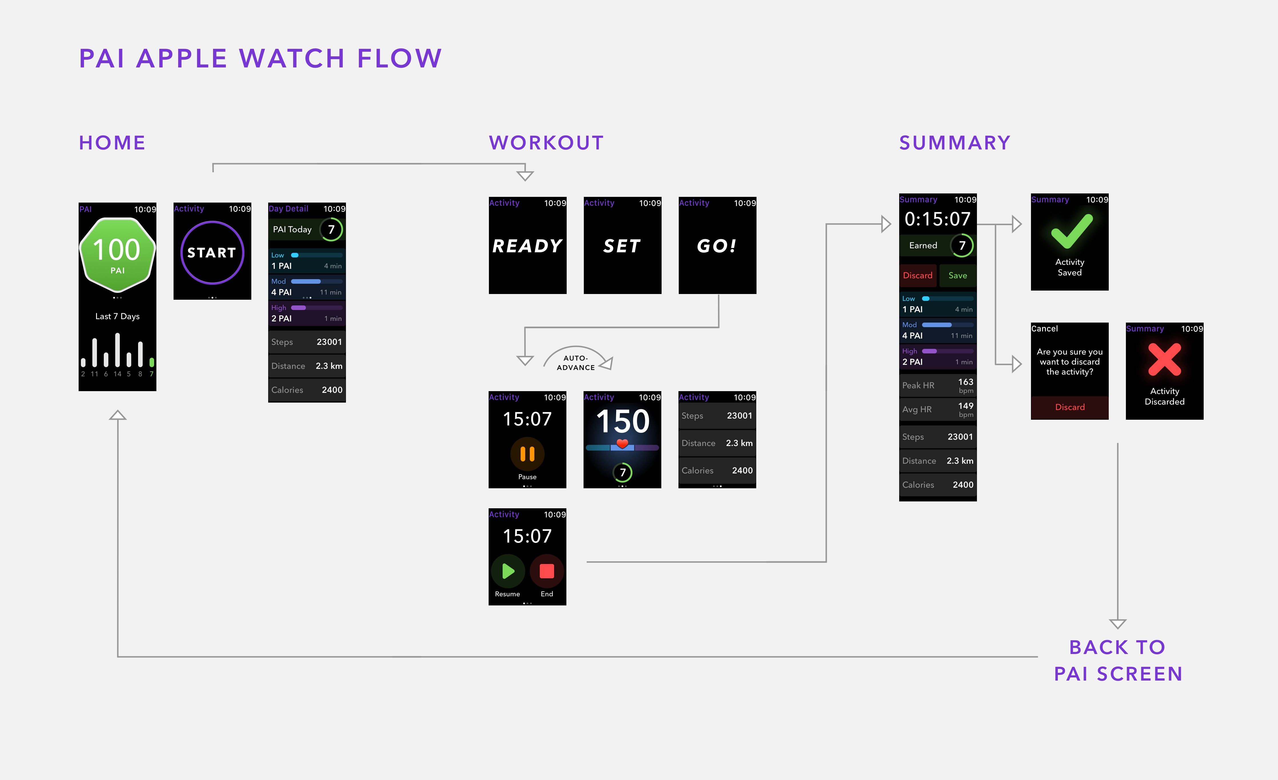
After deciding to move forward with a hybrid of the "PAI" and "GO" concepts, we already had some ideas about how to improve them:
We removed the 7 outer PAI segments from the "PAI" concept, as it was unnecessary to show past days' PAI so prominently
We removed the live HR screen because of limitations in Apple's heart rate API
We condensed the in-activity screens to be more glanceable
We removed the post-workout intensity-vs-time chart because of developer time constraints
We improved the transition between modes, adding a "Ready, Set, Go" animation when starting an activity
We added extra confirmation screens for saving or discarding a recorded activity
We added an auto-advance transition when an activity starts, to show where to find the pause button without overemphasizing the timing screen
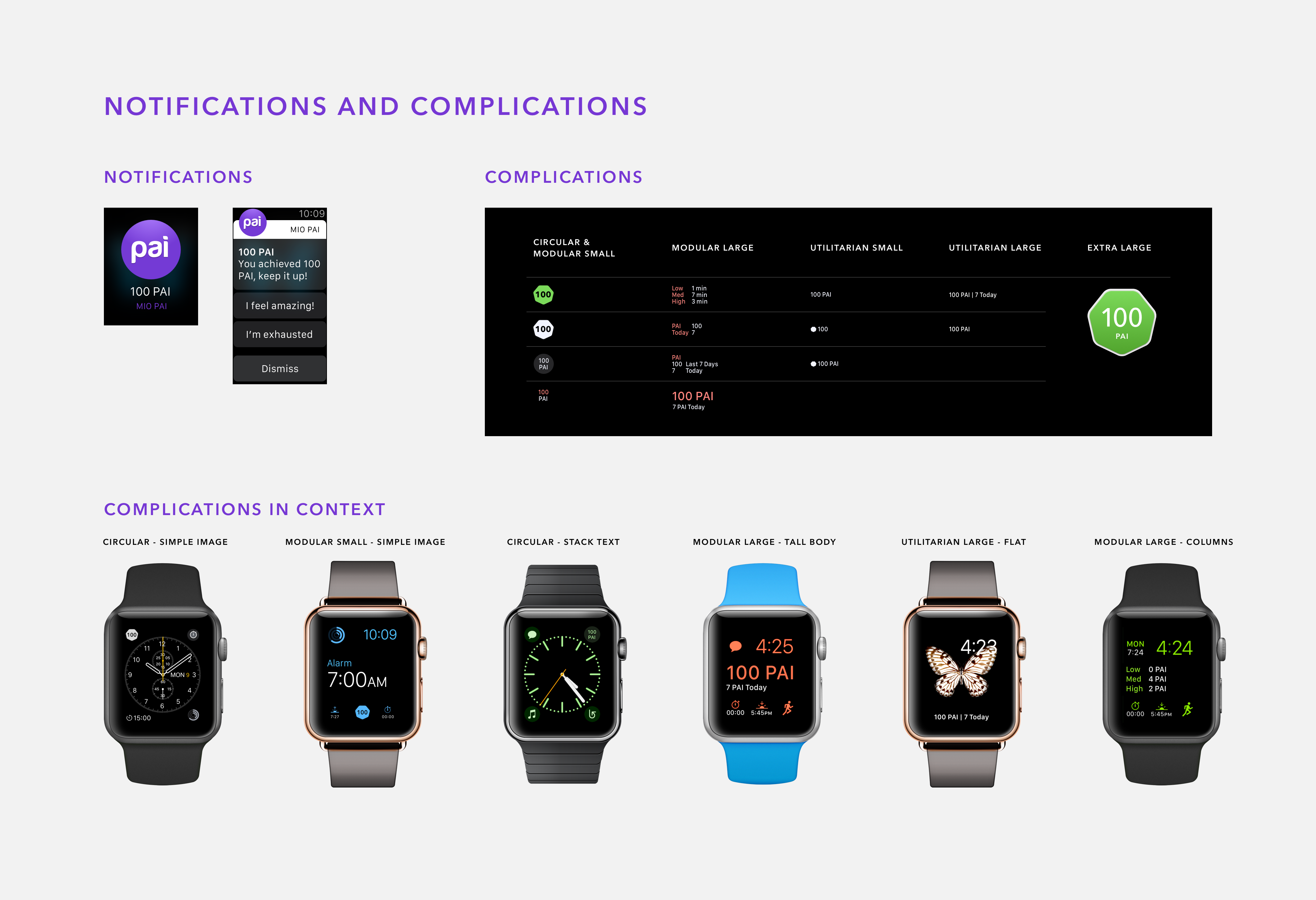
We created several styles of complication so that PAI would be glanceable on any watch face
After 8 weeks of development, PAI Health unveiled the PAI WatchOS app to the media at CES 2017. After a private beta and integration with the main PAI app, PAI WatchOS launched in Summer 2017.
Internally, PAI acknowledged how strong the experience was for such a short product development process, compared to the 2 years and millions of dollars it took to produce the Slice wearable. In late 2017, PAI Health announced a switch away from making their own hardware (and their old name, Mio Global), focusing on running PAI as software on platforms made by other companies. I'd like to think that PAI WatchOS was an outsized contributor to that decision.
Leading the design from start to finish was a rewarding experience for me. Although the short timeline was stressful, it forced us to budget our time and work constructively towards solutions instead of wasting time in debate. Luckily, PAI's product team was supportive in locking down the feature list early, giving us a stable goal to design towards. I also negotiated carefully with the developers, making sure that we minimized development cost wherever possible.
With this project, I learned more about the value of keeping it simple - it allowed us to create a clearer and more enjoyable user experience, get the details right, and deliver on time.

I worked on UX and UI for PAI Health's fitness tracking app, working with the development and product team for over a year to bring PAI to market.
More ➝
I worked with FTSY to design a 3D measurement interface for their app, which helps users find shoes with the perfect fit.
More ➝